![]()
![]()
interdisciplinary ideas
What, Graphing Can Be Fun and Engaging This Year?!
(Data Literacy 101)
Science Scope—July/August 2023 (Volume 46, Issue 6)
By Kristin Hunter-Thomson
In science we have the large lift to teach both content concepts and practices and skills. Sometimes it can be helpful for our students to practice their skills, specifically graphing skills, separately from the content. I suggest that we think beyond the graphs that we are using to teach our content because time “off content” can actually pay out in large dividends for students’ success with our content graphs down the road this year! In fact, we can use ~30 minutes a month to help get students thinking, engaging, and practicing their graphing skills for “Analyzing & Interpreting Data” without realizing it.
Low-floor, high-ceiling, noncontent-related graphs
A large and growing body of research indicates that both connecting STEM content to real-world contexts (Kelley and Knowles 2016) and using activities in which students can engage successfully regardless of where they are in terms of content mastery (English 2017) are highly beneficial to students. The following low-floor, high-ceiling strategies create opportunities to integrate both approaches into our science curriculum without taking a lot of time away from our content.
A low-floor activity is one in which a student only needs to apply a small amount of content knowledge to participate; thus, there is a low barrier to entry. A high-ceiling activity is one in which students are able in the moment to extend their thinking and understanding; it is focused on “idea generation, rather than just the application of routine procedures or problem-solving strategies” (English 2017). Combining these two components into one activity creates opportunities for all students to participate where they are at, generate ideas, gain practice in critical thinking and skills, and build self-efficacy as STEM learners. In fact, research has indicated that creating such opportunities for students to engage in and to stretch their thinking in different ways can result in higher levels of cognitive reasoning in the moment and beyond (Hunter et al. 2016).
Let’s explore some options for how we can sprinkle these kinds of opportunities into the coming school year. But first we begin with the reality that most kids love to talk about themselves or something they are interested in. Why not use that to our advantage while practicing the skill of graphing data? Following are strategies that we have enjoyed using with a wide range of students.
Strategy #1: Co-constructing graphs as a group
In this approach, students answer questions about themselves and place their responses on group graphs to co-construct as a class. To get started, you will need the following materials: markers; large sheets of paper or a whiteboard; and stickers, sticky notes, or dry-erase pens. To prepare, come up with three to five fun questions such as “What are three things you did over the vacation/weekend?” and write each question on a flip-chart page or a section of the whiteboard with the skeleton structure of the graph already laid out. Depending on what graph type you are using, the skeleton structure may include such things as axes labeled, tick marks added, and categories labeled. If using flip-chart paper, distribute the questions around your classroom space. Finally, prepare material sets for each student so that they can respond to each question (i.e., the corresponding number of stickers, sticky notes, and dry-erase markers).
To start the activity, explain to students that you want them to go around the room and add their responses to each question. Give them a few minutes to place their sticker or sticky note or to make a mark with the dry erase pen on each graph corresponding to their response to the question (Figure 1). Once all students have responded to each question, invite them to look at all the co-created graphs and consider such questions as:
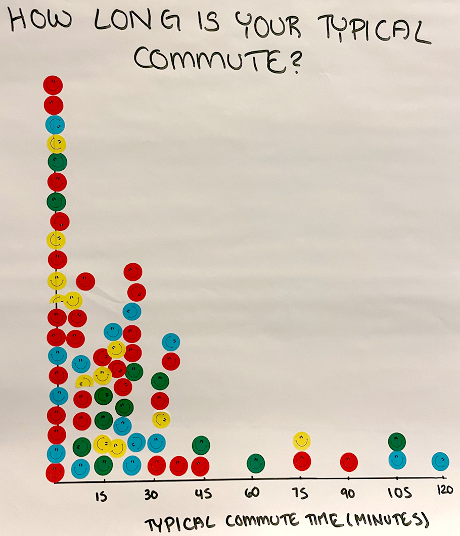
Example of co-constructed one variable dot plot graph on flip-chart paper of students responding to “How long is your typical commute?”
- What do you notice about your own response versus those of our class?
- What surprises you about what you see?
- What is something new you learned about our group as a whole?
- What questions are coming to mind as you look at our data?
The questions you use in this reflection discussion can/should be driven by what you want your students to take away. But a key part of making this a low-floor, high-ceiling activity is to stress that there are no right or wrong answers. Instead, we are providing opportunities for students to connect with their own responses (i.e., to see themselves represented in the graph) and think about the group overall (what we call aggregate thinking, which is critical to making sense of data; see Hunter-Thomson 2022 for more about aggregate thinking).
This activity creates a way for students to engage with graphs and data that are personally relevant. Students get to practice creating and plotting their data point accurately in the graph, but rarely do they think about it from that perspective (as opposed to when we ask them to graph our content data) because they are drawn to answer the question about themselves. Students get to see that there are many ways we can make graphs—not just in Google Sheets. Also, this helps students experience the power in looking at data to ask questions and make observations without having to write a formal claim, evidence, and reasoning (CER)statement.
This activity can take about 15–30 minutes depending on the number of questions, the organization of the room, and how much conversation you are interested in facilitating. We have found that the best questions are ones that (1) are relatively easy to answer about yourself quickly (aka, you can think of the answer in the moment, rather than having to collect the data ahead of time), (2) do not require you to disclose information that you would be uncomfortable to share in a group, and (3) can be visualized in a variety of ways. Following are some example questions and graph setups:
- How long did it take you to get to school today? (similar to Figure 1), or How long did you sleep last night? Students respond by adding stickers to a one-variable dot plot to help them visualize the frequency of each value (this graph type can also be called a unidimensional dot plot; in grades K–5, math curriculum is often called a line plot).
- What is the relationship between how long you slept last night and how long it took to get to school today? Students respond by placing a sticker in the corresponding location of a scatterplot.
- How comfortable are you making graphs? In keeping with the theme of this issue, we could adjust this to How much do you already know about eclipses? (Figure 2). Students respond with sticky notes across a Likert scale tied to numerical bins to create a histogram.
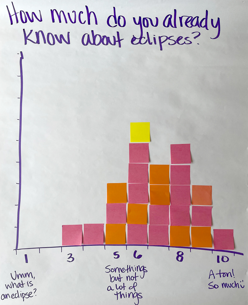
Example of co-constructed histogram on flip-chart paper of students responding to “How much do you already know about eclipses?” (note color of sticky notes does not denote importance, just that those were the colors I had on hand for the activity).
- What are three things you did over the vacation/weekend? Options are listed along the y-axis as categories, and students add sticky notes for each row to create a frequency bar chart.
Interested in trying this out, but still not sure what questions to ask? Check out some great ideas from the Census at School project (see Online Resources) or the Observe, Collect, Draw!: A Visual Journal by Lupi and Posavec (2018) for possible questions/topics to use or adapt.
Strategy #2: Making story graphs of events in their lives
In this approach, students build a graph about a moment in their lives and share in small groups. To prepare, you will need writing implements and paper for all students. I like using plain white paper rather than graph paper to encourage more free-form graph creation rather than requiring students to have straight lines and scaled axes (those are important but detract from this activity). I also create the base graph on the board with the y-axis scale ranging from Good to Bad and the x-axis origin bisecting the y-axis equally. The x-axis scale ranges from Beginning to End. Then I consider what situation in life we are going to graph together. Options for the situation could be summer vacation, last school year, experience learning science, or (in keeping with this issue’s theme) an eclipse experience. The key is finding a situation that everyone has experienced, that students would be excited to reflect on and graph out, and that does not put students in uncomfortable situations sharing with one another.
To get started, I orient students to the axes and share that we are going to graph a story from our lives. I then role model on the base graph my experience of the situation. For example, if we were using summer vacation as our life moment, I would start drawing out my line, narrating in real time what happened to me that resulted in the location and movement of the line, and adding annotations of key moments to the graph (see Figure 3, red line). I make sure to include highs and lows in my story line and annotations. Then I pause and verbally reflect on a key moment of my story where, if circumstances were different, subsequent events might have been different. I make a hashed line to indicate how things could have been different following that key moment (see Figure 3, black line).
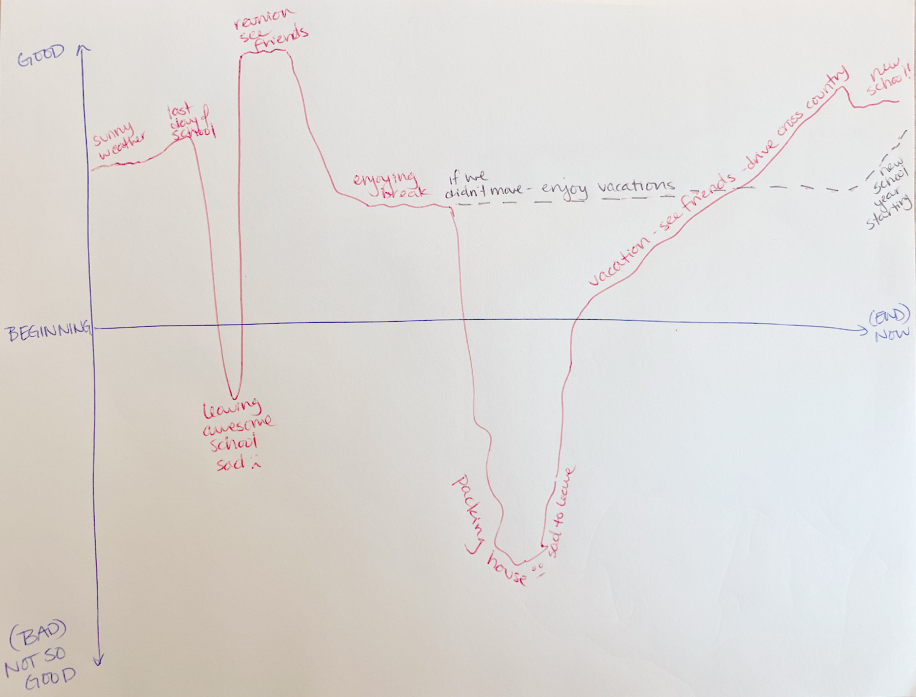
Example of a story graph of my summer vacation (red: what happened; black: what could have happened) that I would create in real time when explaining the activity to students.
Before asking students to create their own graph, I check for understanding of the task. I remind them that we will share our story graphs with a partner, and they should keep that in mind when deciding what to include in their graph. Then I give them five to eight minutes to create their story graphs independently while I circulate to answer any questions. Once it seems that everyone has completed their graphs, I invite them to share with a partner. How much I scaffold who and how they talk to one another is dependent on the students and ranges from entirely student directed to more scripted by me.
Following the partner share-outs, I ask if anyone would like to share about their experience graphing their story and/or thinking about a key moment and possible other outcomes. I intentionally do not ask students to share their graphs or stories, but rather to talk about the experience of storytelling and making their graphs. This encourages students to think about the graphing process and representational aspects of the story graph.
There are a host of social-emotional benefits to sharing our personal stories in safe and supported environments. For example, it can help us process our experiences, build our confidence and ability to communicate with others, build empathy for others, foster community and a sense of unity in a space, and so forth. Using this structure to get to know our students at the start of the year and throughout the year can be a powerful way to lift up their voices and lived experiences.
There also are some interesting and important data skills that students practice as they are graphing their stories. They are reinforcing the representational nature of a line in the graph. The line literally represents their experience or emotions during the life situation. Therefore, they have a personal connection to the highs and lows of the line rather than seemingly random data values from a data table. They also need to consider the interplay between the two axes (Good–Bad and Beginning–End) to think about where to draw their line to best represent the moment in terms of the emotional experience (y-axis) and the time (x-axis). In other words, they are getting an up-close experience of why we plot data where we do. Also, when students pick a key moment and think about what could have been a different outcome, students are practicing their prediction skills and considering how different data would lead to different conclusions or takeaways from a graph.
I have found that it can be helpful to share some story graph examples (I type “shape of story examples” into a search engine’s Image option) and/or collectively graph a story together. Fairy tales that are familiar to many students and available in short, animated video clips on YouTube have worked well. This is also a great opportunity to coordinate with our English language arts and/or social studies colleagues and use this story-graphing approach across disciplines to practice graph skills while telling stories. This approach was inspired by work by Anna Babarinde, Science Coordinator at the Sonoma County Office of Education (California), and Kurt Vonnegut’s Shape of Stories theory.
Conclusion
You can use these two low-floor, high-ceiling activities in ~30 minutes a month to help your students build their graphing skills. In my experience with students and the teachers I work with, this “off-task” practicing results in more success the next time students have to graph science content data. And we can all have fun in the process!
How are you helping your students build their graphing skills using real-world contexts and in low-floor, high-ceiling activities? Share them with the hashtag #MSLFHCgraphs so we can learn from one another.
ONLINE RESOURCES
Census at School (international school-based project to collect data and explore statistical problem solving, a large database to compare with and question bank to choose from)—https://ww2.amstat.org/censusatschool/
Kristin Hunter-Thomson (kristin@dataspire.org) runs Dataspire Education & Evaluation and teaches data storytelling at the University of California, Santa Cruz.
Interdisciplinary Teaching Strategies Middle School